The cicadas of dawn hardly begin their song when the writerer penetrates the Thottoht. A warm wind erodes its white stone walls. Inside, the sound of drizzle gives way to a low, hushed mantra that slowly envelops the writerer as she takes off her rain goggles. There is no one to greet her. For a few moments, she enjoys the idea that this closed place that she will occupy for a few days has only ever been inhabited by her predecessors. She had been chosen to produce the only font family of the year, which would join the pantheon of typefaces of the common script already produced. Far from being anxious, the writerer does not feel the weight of the task entrusted to her. On the contrary, entering the building makes her feel at home. She feels as if she has found a family that has secretly always been with her. .
Once her boots are off, she mechanically performs the ritual greetings and then climbs the stairs leading to the creation space. From step to step, the black and grainy walls give way to a smooth and concrete space, strewn with red stone chips whose random dispersion sometimes forms sigils supposed to bring her luck. The air is tepid and the latent music ends up becoming so natural that she does not hear it anymore, passing from her conscious to her unconscious, while she slides on the last steps as if she was floating. The writerer finally sets foot on the circular mezzanine. In the center of the mezzanine, the floor is recessed in a concentric circle. In the middle of this circle, the terminal is installed; a unique computer intended for the ritual she is about to perform. She contemplates the creative space built especially for her: neither the layout, nor the decoration, nor the terminal had ever been the same. Every time each writerer had it be completely reinvented, with the exception of the dedicated algorithm in the device’s system.
The writer lets herself go into a reverie. She thinks of the people who, 200 years ago, invented new iterations of writing like her. Despite the gulf between their times, she feels close to them. She has fun imagining explaining contemporary typographic theory to 20th century adelphs: «Once a year, a volunteer is drawn from a list of would-be typographers, who must be able to justify having already produced a stasis: a complete typeface of a single variation reflecting a strong singularity. This stasis, no one but its designer must have ever seen it. It is considered sacred and even the writer is not allowed to use it to compose a text. But this first character is only a chrysalis. After a drawing ceremony in trance, it gives birth to the prism, a family of 22 variations all stemming from altered drawings of the stasis. If the conception of the stasis requires the draftsman of great historical and technical knowledge, the process of hatching is, itself, a sensitive experience. A poetics of the form of the writing.»
The writerer comes out of her reverie. She walks towards the terminal, crossing the room covered with a black latex carpet and connects her _stasis _to the computer which now appears on the screen for the first and last time. After the ritual, it will be impossible to see the original character again. The writerer gnoses the drawing, centers her breath and enters into a meditative state, paying attention to purely what surrounds her, outside and inside. The smell of the carpets, the aching of her intercostals, the crackling of the screen, the feeling of impatience, the red sigils, all pass through her in the most objective way possible. She then cracks the single can of cold-brewed coffee placed near the terminal and printed with characters of the last created prism. The list of ingredients speaks to her: Chamomile, Calea, Agastache, Mimosa, and of course Peyote. These are the molecules of the hallucinogenic cactus that will allow her to get in touch with those who can guide her to create the prism of this year. She brings the can to her lips and enjoys the beverage in small gulps, while concentrating.
Slowly, her perception of light changes. From the grey and black that surround her, small luminous flashes begin to emerge, first on the periphery of her vision and then around the screen, until they completely inhabit her. She is no stranger to these altered states of consciousness which are also part, to some extent, of the stasis drawing process.
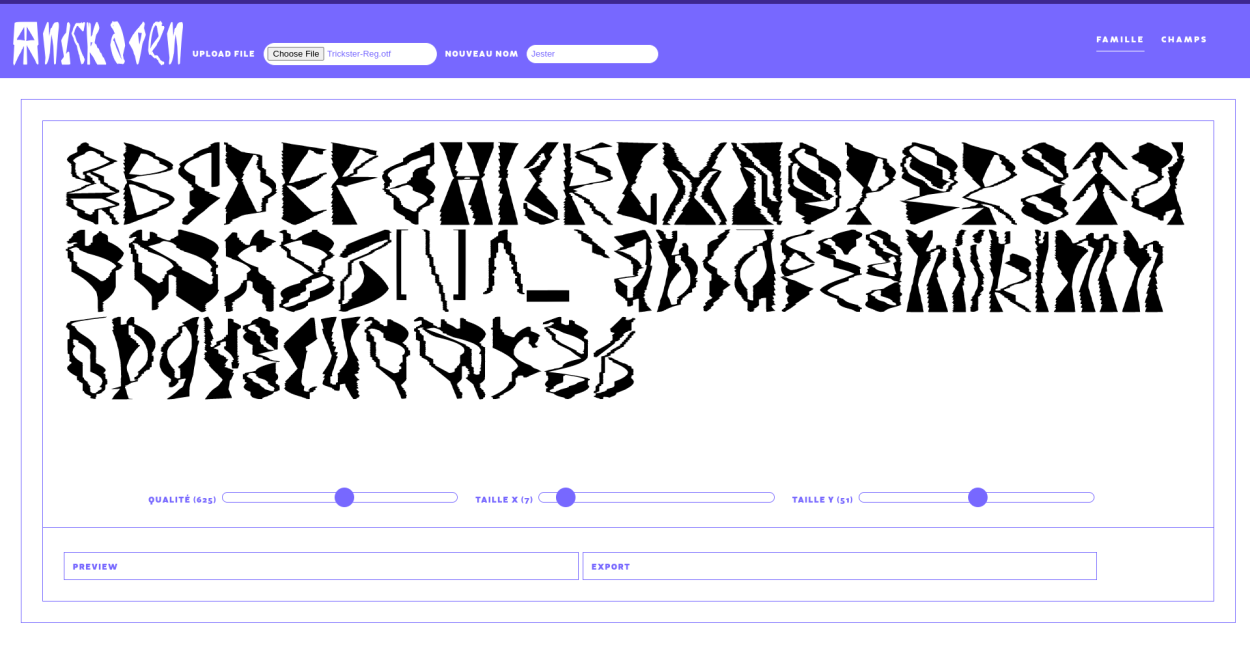
Without her being able to say how much time has passed, the snatches of psychedelic lights finally reveal the rhizomes, dozens of small beings with cellular appearance composed of characters with changing colors. They wriggle, as a greeting to the writerer, while whispering beautiful incantations to her. Their hubbub, similar to the ethereal crackling of ants’ steps, amuses the writer who plays at answering them. A non-verbal dialogue takes place while the rhizomes navigate in dance around the stasis displayed on the screen. Their concentration ends up being denser around the elements of the creation interface, so simple that they are only composed of two cursors, manipulated at a distance by a movement of the hands. The actual creation ritual can begin.
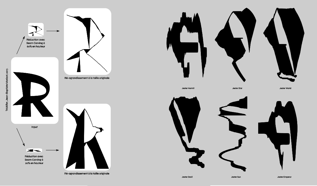
Nobody remembers how the algorithm came to modify the uploaded stasis. The results are always different, making it difficult to understand a pattern. As the cursors begin to move, the glyphs are caught as if in a storm, sometimes calm, sometimes violent, capable of tearing their contours as well as polishing them. The design of the stasis remains recognizable to the person who had created it, but it would be absolutely impossible for the future reader to find the original design. It is clear, however, that all the results are underpinned by a common structure that was present in a ghostly way.
With each movement of the cursor, a new generated version appears on the terminal, always unique, and ends up making the writerer enter a labyrinth of forms in which she has to orient herself. When she hesitates in the choice of a declination, the rizhomes come to her aid. In groups, some of them seem to discuss with each other, others speak directly with the font. From time to time, one of the little creatures approaches the writerer to update her on their thinking. If she was initially navigating by instinct, it was only an appetizer for the state of flow that was intended. In this state of pure vitality, nothing is chosen randomly and she intuitively finds the best possible results. Her feelings are no longer a faint light to orient her in an unknown dark ocean but become a map: as precise as possible. She has 22 variations to choose and she will choose them with full awareness. Each one has to be unique, a kind of herald with a marked personality, taking advantage of the expressive results that the algorithm allows. Each proposal was an encounter, a metaphysical speed-dating. Some drawings frightened the writerer, while others touched her. Some are mysterious, others more eloquent.
She is ready to choose the first character and the rizhomes seem to approve her choice. A simple character, but one that would be a good gateway to the family. The writerer validates it and the first declension name appears: 〚Fool〛.
What gives contemporary typographic culture its particularity is not so much its unusual mode of production, but the use that is made of prisms. If in the 21st century reading was hierarchical (we orient ourselves in a text thanks to a hierarchy of information made possible by the characters), today’s reading is mainly archetypal (we orient ourselves in the text via emotional archetypes carried by the characters). To do this, the writerer associates to each declination of his stasis an archetype of the divinatory Tarot. The declination 〚Fool〛 for example, carries within it the emotional and sensitive archetype of uncontrolled energy, of the all possible. Just as in the 20th century a blackletter font was able to carry within it feelings related to the Middle Ages. The 〚Fool〛 was the first declination of the _prism _each year. Thanks to the ritual interface, the writerer was free to choose its aesthetics, and could make it look cynical and dark, as well as joyful and carefree, and thus tint it in a very special way, specific to its creator. As in the divinatory tarot, each of the variations did not exist isolated from the others. Choosing an evil 〚Fool〛 certainly had consequences for the declination itself, but also for the whole web of meaningful relationships that the declination would have with the other members of the prism. This was where this system became both complex and magical: the aim of the writerer was not simply to work on aesthetics, but to create a small universe of poetic relationships. The new prism would be integrated into the other existing prisms, where the meeting of new semantic relationships and old ones will unite in a coherent aesthetic, allowing them to be used together. And to give even more strength to this already subtle game, one and only one person was allowed each year to produce a prism, making it precious and carrying a powerful aura.
The writerer can now move on to the 〚Magician〛. The interface reels, hears the command and moves to the next character, incrementing a horizontal bar by one. As one moves through the family selection, the stasis modification algorithm also changes according to a parameter called the niprat. The basic cursors seem to continue to have the same type of action, but the results vary from the previous variations due to a parameter that is difficult to define. It is as if the curves are becoming more and more precise. More and more dense, crisp and angular. To neophyte eyes - when children were learning to read, for example - this variation was not easy to detect, but nothing was simpler for trained eyes. Just as it had been simple for a twentieth-century person to notice the difference between a serif and sans serif character, any adult reader would instinctively know whether the character before his or her eyes was the 1st, 10th, or 16th declension of the prism -in other words, the 〚Magician〛, 〚Hanged-Man〛, or 〚Tower〛 versions- obtrusively coloring the sentence with complex feelings.
This capacity of the text to add to the meaning of a sentence emotions linked to the archetype of the chosen tarot, had created a discipline of writing thus called prismatic. In his text editor, a person had several thousand characters at his disposal for free and could choose precise typographical variations in order to color entire pages, certain precise words, certain letters, sometimes the punctuation itself, and thus create unexpected combinations of meaning. It was possible to write one’s text as an archetypal monologue, just as it was possible to use dozens of different masks, all singing the same speech.
These semantic games had been particularly invested in by literary authors. If most of them used prisms in a rather ordinary way, others had distinguished themselves by real typographic adventures. Annア~Kos, for example, had composed a tragic saga about the life of an immortal amnesiac dog, witnessing the eternal death of his masters, only in 〚Tower〛 declinations of 200 different prisms, surveying the infinite collapse of his reality. Razcul[Grntr] had revived the breathless style of noir novels by creating layered plots of deception, taking the gullible reader through mazes of subtle clues and counter-clues whose outcome was impossible to anticipate until the end of the book. S:)l1tSBC, on the other hand, was the source of a renewed interest in Kabbalist techniques, giving rise to the greatest metaphysical poetic narrative of the thirtieth century. Each person who wished to purchase the book was subjected to lengthy ceremonial psychological interviews in an altered state of consciousness. These interviews were used to assign a precise prism to each stanza, allowing the reader to produce a mystical exegesis that would answer his or her own inner questions.
On the scientific side, we were surprised to discover that writing by prism allowed us to solve problems that had been unsolvable until then. The integration in the formulas of certain typographic variations had for example allowed the mathematician Obr&Kls to solve the Riemann hypothesis, which had given birth to a whole new branch of mathematics based on the use of contemporary typography. But it was especially the social and anthropological sciences that had benefited most from the prisms, since each publication could now approach more precisely than ever the ambiguity inherent to the complexity of the study of human and animal lives. Within a few years, they had had so much impact on society that the period 3045-3050 was now taught as the «social white fountain.»
From then on, one was aware of the gap between the apparent neutrality of letters and the subjectivity of human speech. Writing was no longer a crystal goblet, but an obsidian grail.
10 hours have passed since the writer started the ceremony. About to choose the last declination of her prism, she feels that the peak effect of the Peyote is reached. Facing the terminal, she is now sure of the declination to select for〚World〛, the final archetype of conclusion, perfection, and accomplishment. She wants to enjoy a few more moments of the oceanic feeling that allowed her to hatch her stasis in prism. She knows that it will only last until she validates her final choice and the ceremony ends. The rhizomes are not scattered any more and now form one great being made of thousands of letters, which surrounds the last declension, curled up against it, ready to baptize the typographic family to make it enter the great family of the common writing. With their familiar crackling, the rhizomes sing the final song, chanting the name of the new prism like a mantra: Jester !¡ Jester !¡ Jester !¡